What Not to Wear in Holiday Photos
Holiday Photo Don’ts -And What to Opt for Instead
Tis’ the Season for Holiday Photos! Holiday photos and dressing can be so much fun. I love the little bits of glitz that we add to our outfits around this time to add some festivity to our outfits. That being said it’s easy to blur the line between festive and kitsch. Here is an example of what NOT to wear for photos and some more elegant options to consider in your search for inspiration.
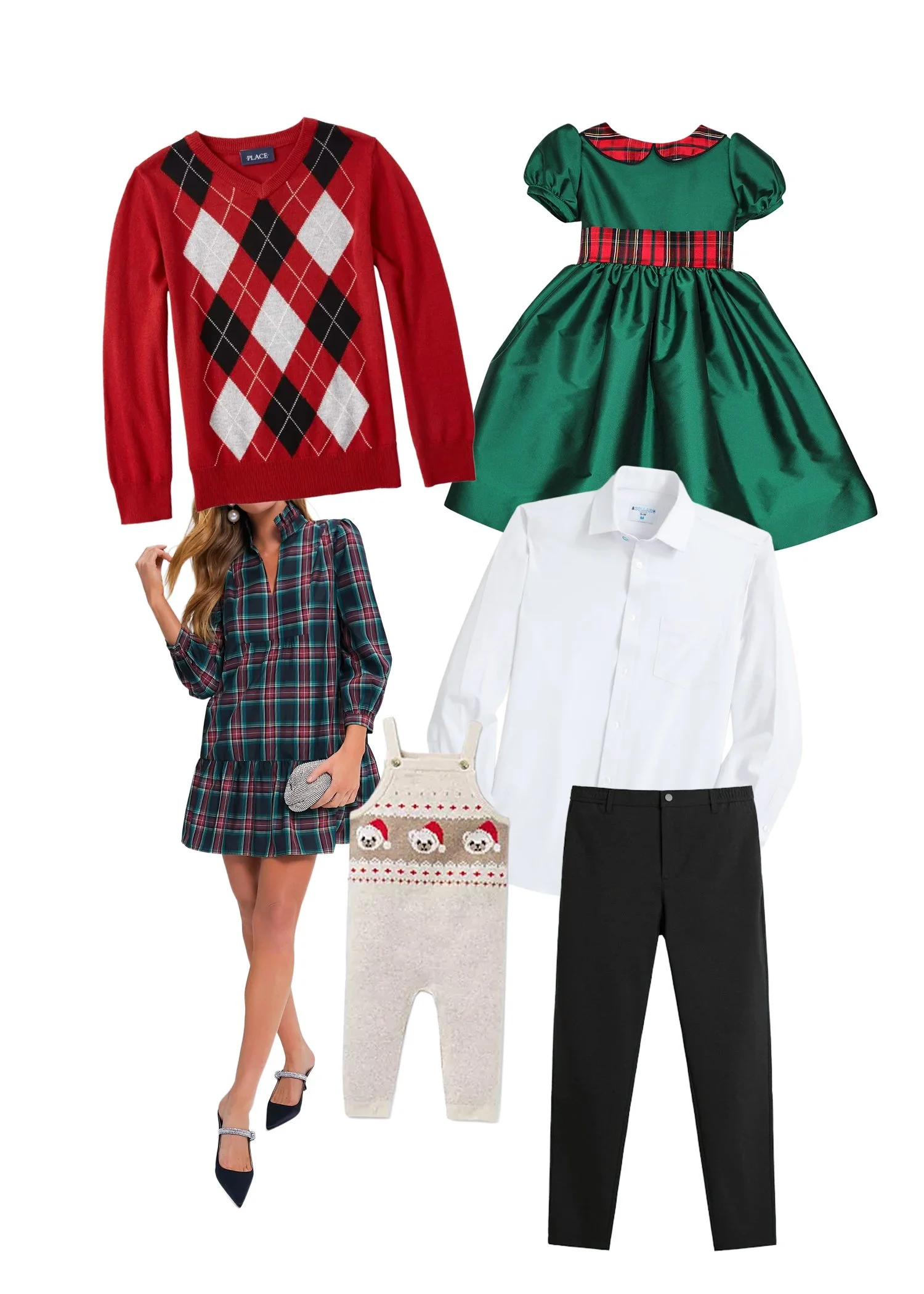
Here is an example of what NOT to wear. While there is nothing intrinsically wrong with these individual pieces, when put together they are far too busy and won’t create a clean and cohesive photo. Bright red and green tones, shiny fabrics, and busy patterns can create harsh color casts and pull focus from your faces.
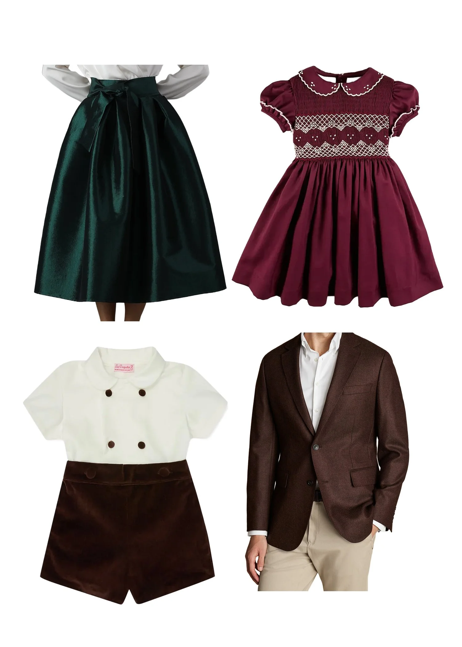
A polished, formal option for family holiday photos — rich, muted jewel tones of traditional holiday colors and classic textures that look elegant and cohesive on camera.

A semi-formal look that feels festive yet timeless — think soft neutrals, deep greens, and textured fabrics that add warmth without overwhelming your photos.

A refined take on casual holiday style: warm, cohesive colors without the distraction of bold patterns.
I hope these ideas bring a little festive inspiration to your holiday family photos—celebratory, but in a subtle and timeless way.